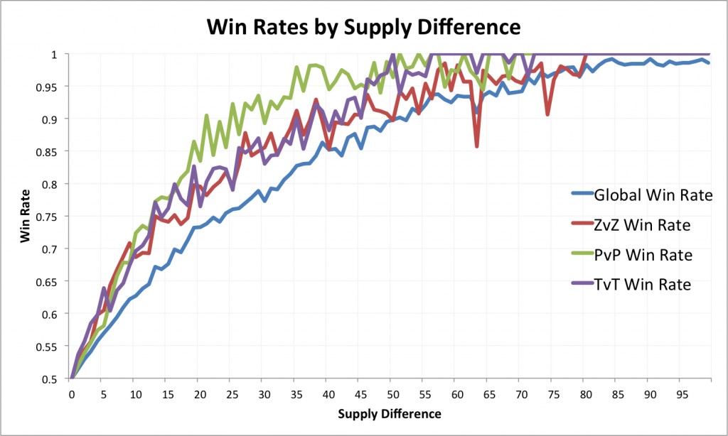
A week and a half ago, I slapped together some graphs about the importance of supply differences and posted it to reddit. There were a ton of very thoughtful comments from the community, some of which I riffed on to create more graphs and investigate more of the data. This post is a summary of the rest of what I found, with all data available in this spreadsheet.
The first graph shows the global win rates and win rates in mirror matchups given certain supplies. The most direct way to use the data is to observe a game and point back to the graph at any time to figure out how much of an edge someone has. Continue reading

